Who knew being prepared ahead of time would be so relaxing and peaceful? LOL I actually got to stamp along while I hosted a Chat & Challenge over at the demonstrator only site Sudsol!
This is a birthday card for our niece. The original sketch came from PaperCraftPlanet online, from a couple of weeks ago. Can you see the Dazzling Diamonds Glitter around the edge of the Certainly Celery, as well as being the icing on the cupcakes?
My design uses three current SU! stamp sets: Crazy for Cupcakes, Circle Circus & Hugs & Wishes. It also uses Melon Mambo, Elegant Eggplant, Certainly Celery and Whisper White. Accessories: Blender Pen (for watercoloring from the ink pads), Melon Mambo Polka Dot Grosgrain Ribbon, Wide Oval Punch, Dazzling Diamonds Glitter, Two Way Glue Pen & Dimensionals. ENJOY!
Tuesday, December 22, 2009
Friday, December 18, 2009
Our Christmas Card
Merry Christmas! I see it's been quite awhile since my last post. I am guessng most of you have been as busy as me and my family have been since Thanksgiving! Our personal Christmas cards are now complete, as of this evening. Now it's on to baking, cleaning, baking and baking! Woohoo!
This year's design uses several different sets - both current and retired! The current set used is Holy Triptych (love this set!) & Heard from the Heart (on the envelope back)! Current Holiday Mini Accessories: Stampin' Up! Movers & Shapers Holiday Windows and the Ornament Punch. Current Accessories: Versamark Ink Pad, Large Oval Punch, Gold Embossing Powder, Heat Tool and Embossing Buddy. Retired sets include: Star-Studded Season (for both sentiments), Forest Foliage ( the pine branch to create the Christmas tree background) & All God's Children (on the envelope front). I also used the retired Wrought Iron Corner Punch on the inside layer, then folded the corners under for the lovely accent you see above. A Zig Painty Pen created the ornament strings. Colors used were Bravo Burgundy, Mellow Moss (with Handsome Hunter stamped on it) and Whisper White.
I count you all among my blessings, and you are in my prayers. From my family to yours - May God Bless you abundantly this Christmas season and throughout the New Year! ENJOY!
Sunday, November 22, 2009
Swiped Lighthouse Card
Here is the second design using the Baby Wipe Swipe Technique - only this time I used SU! Glossy White card stock. The Glossy card stock soaks in the colors, and gives a softer, almost pastel look. (Would be great for baby colors!) See THIS POST for directions on how to try this technique.
Colors used here are SU! Crushed Curry, Soft Suede, Old Olive, Dusty Durango and Whisper White. The "enjoy" sentiment comes from a retired SU set called "Sweet Sampler", and I markered just the word to use. ENJOY!
Saturday, November 21, 2009
Thanksgiving Card
Have you seen or tried the "baby wipe swipe" technique? That's the striped layer you see here. For this design, I used Whisper White so the colors would be more vibrant. (My next sample will use Glossy White card stock, which soaks in the ink and gives softer look.)
The focal image comes from the SU! set "Gifts from the Earth" in the current Holiday Mini Catalog. I left it uncolored on purpose, to contrast with the brightly colored, swiped layer.
Baby Wipe Swipe Technique: First, choose your Re-inker colors. Then, take a baby wipe, and fold it up (usually at least twice) so that it fits easily in your fingers and doesn't hang over your fingers too much. Next, 'stripe' the wipe with one re-inker at a time, placing the stripes as close to each other as possible without mixing the colors. Lastly, begin above your cardstock, and swipe the colored stripes with firm pressure down the card stock and off the other side. Repeat the process moving to the side (left or right depends on what hand you use) until you've covered your entire piece of card stock. Let dry before trimming and adhering to your main layers. Note: You can also create a plaid look, by turning your card stock and repeateing the swiping process in the opposite direction.
For this design, I used Soft Suede, Old Olive, Crushed Curry and Dusty Durango re-inkers. Along with the Whisper White, I used Soft Suede and Old Olive card stock, and Earth Elements Buttons with Linen Thread tied in the centers. I adhered the buttons with Mini Glue Dots (LOVE those!) And I can't forget the Dusty Durango Polka Dot Grosgrain Ribbon that I used polka dot side down. The sentiment comes from the retired SU set "Holidays and Wishes." the focal image was finished off with the Ticket Corner Punch. ENJOY!
Tuesday, November 17, 2009
Poinsettia Framed Snowmen Card
Here is the fourth and final design of the workshop projects. I was thrilled when SU! came out with dry embossing folders for the Big Shot! They are slightly bigger than other company's embossing folders, so they actually cover the entire front of a standard card front, rather than just creating an embossed layer. This folder is "Petals a Plenty". I learned how to create this dry embossed 'frame' from fellow SU! demonstrator Patty Bennett. For this design, I used a wooden picture mat with the oval pre-cut from it that I picked up at the craft store.
The focal image comes from the Level 3 Host set "The More the Merrier", stamped in Basic Gray and colored in using a Blender Pen and Stampin' Write Markers. The Two Way Glue Pen adheres the Dazzling Diamonds Glitter to create the 'snow' the snowmen are sitting on. I also used the Real Red Stampin' Write to color the middles of the poinsettias to add just a touch more of color. The Modern Label and Word Window Punches, along with the Red Gingham Ribbon complete this fun design. ENJOY!
Monday, November 16, 2009
Thoughts & Prayers Card
Here is design 3 of 4 from the THO (totally hands on) workshop this past weekend. The featured SU! stamp set here is "Thoughts and Prayers", along with the simply gorgeous "Bella Bleu" Designer Series Paper (DSP).
What do you think of the DSP vase? It's the Ornament Punch currently in the Holiday Mini Catalog! So if you thought the Ornament Punch would only be useful at Christmas - now you can go ahead and order it because it makes the cutest vases! :) The Designer Label Punch is also used to make a 'window' for the sentiment. A few Not Quite Navy Brads and some strips of Kraft Taffeta Ribbon finish off this lovely Not Quite Navy, Bordering Blue, Very Vanilla & Kraft color combination. ENJOY!
Sunday, November 15, 2009
Gifts of the Earth Card
This is design 2 of 4 from the workshop at Beth H.'s today. For this design, I used the SU! stamp set "Gifts of the Earth" (fabulous Fall images in this set!) from the current Holiday Mini Catalog, along with the jumbo wheel "Bright Blessings".
I pulled out the old favorite Watercolor Pencils - one of the first products I bought, along with the Stampin' Pastels. The Watercolor Pencil colors mix wonderfully with the added touch of the Blender Pen. See the watering can in the focal image? It looks like I had a Bermuda Bay pencil doesn't it? I mixed two colors and it cam eout almost an exact match! Woohoo!
I love using the tone-on-tone technique to create subtle backgrounds, like I did here using Dusty Durango ink and card stock - both for the wheel image AND for the suede texture on the top half using a crumpled piece of plastic wrap (first tapped on the ink pad, then onto the card stock, repeating as necessary.) The suede texture was also added to the Dusty Durango Photo Corner Punch that embellishs the focal image.
I think Dusty Durango is my favorite In Color right now - and look how beautifully it goes with the Bermuda Bay and Soft Suede! A strip of Soft Suede Polka Dot Grosgrain Ribbon, polka dot side down), the Photo Corner Punch and a couple of gold brads finish off our lovely Thanksgiving/Fall design. ENJOY!
Saturday, November 14, 2009
Cinema Saturday #59 "Roman Holiday" - Christmas Roses
I didn't realize as I made this for my workshop- that it also fit the Cinema Saturday #58 challenge movie - "Roman Holiday" - make something will pearls! I think the rose image, 'royal' colors and classy hat pin fit the bill for a princess, don't you?
I adore the floral images in SU!'s set "Fifth Avenue Floral"! They are just so beautiful, whether you color them with shading techniques or just leave them as is like in this sample. This is the first of four designs that we are making at a totally hands on (THO) workshop today. (ALL my workshops are THO - so call me to book yours!) This is one of the Christmas designs, though I chose a sentiment from the "Heard from the Heart" set so I could use this is a card for my parents whose anniversary is a few days after Christmas. This is also the first time I have tried my hand at using the hat pin embellishments that are part of the "Pretties Kit" (Awesome kit! Dyeable white flowers in several sizes, full and half pearl sin white and ivory, hat pins and clear plastic crystal-cut beads...)
STAMPS: Fifth Avenue Floral, Heard from the Heart
CARD STOCK: Handsome Hunter, Bravo Burgundy, Very Vanilla
INK: Bravo Burgundy Classic Ink, Very Vanilla CRAFT Ink
ACCESSORIES: Pretties Kit, 5/8" Bravo Burgundy Grosgrain Ribbon, Mini Glue Dots
ENJOY!
Friday, November 13, 2009
More Altered Notebooks
Here is another altered composition notebook. I made many, many of these - in pairs with different colored main layers. This one uses Basic Gray as the main layer. Other colors used (but not pictured) included Chocolate Chip, Close to Cocoa, Creamy Caramel, Sahara Sand, Basic Black, and Kraft. All pairs used the same Real Red and YoYo Yellow accents. Images and sentiments used are a mix of Stampin' Up! and GinaK Designs, as well as the Worldwide Marriage Encounter stamp. I hope the recipients of these dialogue notebooks ENJOY them! Our friends had a wonderful idea for using these as gifts for their support team.
Wednesday, November 11, 2009
Altered Composition Notebook
This is one of a pair of my latest altered composition notebooks made for Marriage Encounter friends. I used the current set "Enjoy Every Moment", retired set "Coast to Coast" and a Marriage Encounter stamp. I used the colors Old Olive, Soft Suede, Crushed Curry and Very Vanilla. I stamped off the Old Olive "enjoy", and stamped the lighthouse in Soft Suede. To add a little tone on tone texture, I used plastic wrap tapped on the Soft Suede ink pad and then tapped onto the card stock. A few SU vintage brads add the final touch. ENJOY!
Friday, November 06, 2009
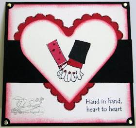
A "Love"-ly Design
I feel like I am on a roll! I cleaned off my stamping table this week, and have been using up 'left overs' that I've been keeping - you know the ones, those scraps and extra Big Shot cut outs you are *sure* you'll use so you don't throw them away? Okay - so my pile of these is waaay bigger than what I've used up so far, but hey, a girl can feel good about what she does use, right?! :)
I immediately loved this sketch when I saw it on GinaK's blog. I never would have thought to slide a layer between layered cut outs - but I really like the effect. I am going to try this layout for some altered notebooks I want to get done. I think it will be really pretty. For more inspiration for this sketch, check out GinaK's blog or StampTV - as this is actually one of two sketches - a simple one and a step-it-up one.
I'm not sure what occasion I will use this card for yet - possibly a Christmas card for my honey, or a support letter for a Marriage Encounter Team Couple, or maybe it will even last until February to be a St. Valentine's Day card for my honey (probably the most likely! heehee)
Both the image and the sentiment come from the GinaK set "Hand-in-Hand". In case you go check out this fun stamp set - I drew the fingernails in by hand with my Basic Black Stampin'Write Journaling Marker. I used Basic Black, Real Red and Very Vanilla. I paper-pieced in the dress sleeve with some Real Red patterened DSP I had left over, then used my Glue Pen on the polka dots, to create the bracelet on her wrist, his cuff link and edges of the scalloped heart to add some red glitter. The Ticket Corner Punch leaves a wonderful little nook to place some gold brads, and a stamping sponge with Real Red ink finishes off the edges of this design. I hope the up close shot helps you to see the glitter detail better! ENJOY!
Thursday, November 05, 2009
Gifts of the Earth Card
I hosted another Chat & Challenge over at the demonstrator only website - Sudsol. I got this awesome sketch from Taylored Expressions. It is quite different than my usual style, so I played along to get me out of my box a bit more.
I really like the "Gifts of the Earth" set in the current SU! Holiday Mini. the images are lovely, and all have wonderful coloring potential. This time around, I water-colored using my Blender Pen and ink pads. In Colors Bermuda Bay and Dusty Durango along with some Chocolate Chip Patterns DSP and Very Vanilla. To add some texture, I used a bit of plastic wrap touched on the Dusty Durango ink pad for a tone-on-tone suede-look, plus a little metal gleam with the gold brads. The sentiment is from the set "Thank You Kindly", and was punched using the Oval Punch and layered onto the Scallop Oval Punch. One more accent - the Photo Corner Punch on the focal image to balance the Bermuda Bay. I added the "Give" by hand - because I wanted a Thanksgiving card. ENJOY!
Wednesday, November 04, 2009
Cinema Saturday #56 - "Legally Blonde"
The Cinema Saturday Movie this week is "Legally Blonde" with an added challenge of making your project 'inspirational'. As you can imagine, there are LOTS of pink projects out there! :) I chose a but brighter, darker pink in SU!'s Melon Mambo. The sentiment is my 'inspiration' point, "One person can make such a difference and that person is you!" Both the Iridescent Ice embossed butterfly and the sentiment are from SU!'s Flight of the Butterfly Set. Even the set name points to the character of Elle - who definitely finds her wings and shows how one person can make a difference. Her personality sparkles, as does that of several other of the supporting characters, so I *had* to use the sparkle of Iridescent Ice and rhinestone bling! The dry embossed flowers is a Textured Impressions folder from SU! called 'Elegant Bouquet'. I love that these folders are slightly larger to cover the front of a standard size card, without needing to layer - and of course, I am always thrilled for another reason to play with my Big Shot! (Have I told you lately how much I have been adoring my Big Shot? One of my best purchases this year!)
If you haven't played along with Cinema Saturday yet - why not?! Start this week! There will be a new challenge on Saturday morning, with sneak peeks beginning on Friday. ENJOY!
Super Mom Card
I made this card for one of the Release Party Challenges for GinaK Designs this month. Using a YoYo Yellow solid background is not typical for me - but I wanted this simple design to be bright and cheerful for whichever of my super Mom friends I send it to! The joyful look on "Kindred Spirit - Julia's" face matches with the sunshine yellow she is flying through! For me, this represents the underlying joy that gift of motherhood brings - even if a day isn't going so well, the underlying joy remains.
I couldn't get the detail on Julia to photgraph - but her Brilliant Blue suit is all sparkly from a Spica glitter pen, and her Real Red cape is shiny from a Sakura glaze pen. I used three Stampin' Up! punches - Star, Large Star and Modern Label. Also used - Crop-a-dile, Star eyelets (retired SU), and Dimensionals to pop up Julia and the Super Mom sentiment. (Julia and the sentiment are both GinaK.) ENJOY!
Friday, October 30, 2009
Chat & Challenge #207 - My WWME Card
Bet you thought I wasn't doing Chat & Challenges over at Sudsol anymore, eh? I have been doing them all along - they just haven't been making it here to my blog! This week - I needed to make a specific set of cards to send as post-Weekend notes from the Worldwide Marriage Encounter Weekend my hubby and I helped present this past weekend. It was the perfect way to celebrate our 15th Wedding Anniversary too! Woohoo!
The sketch that inspired my design came from fellow SU! Demo Gretchen Barron. Thanks Gretchen!
I used a combination of current and retired SU products for this design in order to reflect what I wanted to.
Stamps: Enjoy Every Moment and Love You Much (both current); Everyday Flexible Phrases and Expressive Flexible Phrases (both retired), WWME Stamp (non-SU)
Cardstock: Chocolate Chip, Crushed Curry and whisper White (all current), Ridinghood Red DSP (retired)
Ink: Chocolate Chip (curret; Ridinghood Red (retired)
Accessories: Punches - Heart to heart, Scallop Oval, Large Oval & 3/4" Circle (all current), stampin sponge
ENJOY!
Wednesday, October 28, 2009
Cinema Saturday #55 - "Hocus Pocus"
This week is being consumed with a general malaise due to some family members being ill. Yuck! I pray all of you are remaining healthy and/or will have a speedy, uncomplicated recovery if you are already ill.
Anywho - The Cinema Saturday Creative Challenge this week is the movie "Hocus Pocus", with the added challenge of creating something Halloween related. Since I am not able to create something new this week, I wanted to share a link to the Halloween projects I created last year - I thought they were all so cute! Hopefully you'll find som elast minute inspiration here. ENJOY!
Saturday, October 17, 2009
Cinema Saturday #54 - "Finding Nemo"
I am so excited to be a Guest Designer for this week's Cinema Saturday Creative Challenge! This week, CSCC also has a Special Sponsor and Guest Designer - Taylor Van Bruggen. I am familiar with Taylor's site, and her awesome weekly Cupcake Sketch Challenges! Taylor is offering some yummy Blog Candy for the CSCC this week - so be sure to play along for your chance to win!
As you can see, Taylor's pick for our movie inspiration this week is "Finding Nemo", and she included a special Color Challenge (shown on the right side of the banner above). I used Stampin' Up! Tempting Turquoise, Brilliant Blue, Only Orange & Whisper White on my design.
My first thought for "Finding Nemo"was the love of a father for his children, which reminded me of the "Mrs. Doubtfire" Challenge two weeks ago! But that SU! "Summer By the Sea" (retired) image is so 'two weeks ago'! (heehee) My next thought was the same stamp set, but the image of the little boy building a sand castle. This image reminds me not only of the beach and the sea, but also of the 'home' Nemo leaves behind in search of adventure. Then I thought about a clown fish made out of punches. So how to incorporate the two ideas? Why a birthday card with a 'gift' attached - a clown fish jumbo clippie bookmark! I went to the Disney "Finding Nemo" website and looked at gallery pictures there to try to re-create a clown fish for the clippie bookmark. I like the outcome, and it got thumbs up and smiles from my kids too!
Here is a look at how the inside of the card looks, for those paper-crafters like me who need to have a visual to "understand" a concept. The oval was cut out of the folded over Tempting turquoise card stock, using a Nestabilities and my Big Shot. In order to keep the card the standard 5 1/2" x 4 1/4" - I needed to trim about an inch off the bottom - so that when the clippie bookmark was attached - it would still be the correct size, and fit in the standard A2 envelope. I used Mini Glue Dots in the corners of the inside layer, so the clippie could easily slide in and out.
The clippie bookmark 'Nemo' fish was made using SU! punches - Wide and Small Oval for the body and fins and hand punchs 1/4" and 1/8" for the eyes. I also used the Modern Label Punch for the tail fin. The background scallop ovals are Nestabilities. A Pop Up Glue Dot holds everything to together on the jumbo clippie.
Retired SU! stamp sets "It's Your Birthday" and "God's Blessings" in Brilliant Blue Classic Ink finish off the card, along with some sponging of Tempting Turquoise Classic Ink on the cover.
Thanks to Taylor for the color combo challenge - I always enjoy trying new color combinations, especially when they are still inside my comfort zone! THANK YOU Sankari and Brooke for awarding me the Audrey Award, and giving me the chance to be a guest designer this week! I look forward to seeing everyone's creations...ENJOY!
Friday, October 16, 2009
Cinema Saturday Guest Designer!!
Woohoo! I was chosen to receive the Audrey Award by Sankari and Brooke over at Cinema Saturday Creative Challenge, from Challenge #52 - "Mrs. Doubtfire"! Along with this suave blog decor, I also get to be a Guest Designer for Challenge #54 which begins this weekend! Check out the CSCC blog all day today to see the sneak peeks as they are revealed, and try to guess which movie is our inspiration for the coming week.
I have found these challenges so enjoyable, and I think you will too! So head on over and start playing along - who knows, maybe YOU will be the next Audrey Award recipient!!
And check back here tomorrow too - cuz I'll be posting my Guest Designer design along with the Challenge details. ENJOY!
Thursday, October 15, 2009
Cinema Saturday #53 - "Elizabeth: The Golden Age"
This week's movie inspiration over at Cinema Saturday Creative Challenge was "Elizabeth: The Golden Age" (or the prequel "Elizabeth") with the additional challenge of incorporating a crown in the design.
I admit, I was taken with the crown idea over anything else! I did choose the deep, rich colors of Fall to go with the golden crowns. At first I thought of doing a bookmark, thus I went in search of a Scripture verse that spoke of crowns. I found several ideas for different cards in Scripture verses and with the crown image! I so enjoy these weekly challenges because I never know what inspiration I will have, and I love seeing what everyone else who plays along is inspired to do too!
This design uses the SU! stamps sets "Gifts of the Earth" in the current Holiday Mini, as well as the retired set "Cool Cat" (for the crown.) Colors are Chocolate Chip, Dusty Durango & Confetti Cream. I used the Aquapainter and Watercolor Wonder Crayons to color in the 'bounty'. I haven't used the WCC for a looong time - I missed them! :) The crowns are in Encore Gold Metallic Ink, and I printed the Scripture verse on my computer and punched it out with the Wide Oval Punch. Oh yes, I almost forgot the Fire Rhinestone Circle Brad in the layered crown!
This is a card for some friends of ours who are farmers. I am hoping this will offer some hope and encouragement to them, a they are facing a second year of tough weather and delayed scheduling first getting the crops planted, and now getting them harvested! Please pray for ALL farmers - that they may persevere and yield abundant harvests.
ENJOY!
Sunday, October 04, 2009
Cinema Saturday #52 - "Mrs. Doubtfire"
Three consecutive Cinema Saturday Creative Challenges for me! Woohoo! This week's movie is "Mrs. Doubtfire", with the extra challenge of a pocket or something that opens. So much inspiration to choose from for this movie! For me, however, what stands out the most is the love of a father for his children. I immediately thought of this image from the retired SU stamp set - Summer by the Sea. One of the few images I have seen that portrays a father and a child. I chose to make the focal image a 'pocket' with a sentiment that slides out from underneath by grasping the SU! Star Designer Brad. I also used the retired designer series paper Muirfield. The colors are Baja Breeze(retired), Very Vanilla and Not Quite Navy. ENJOY!
First Christmas Card Sample!
I realize that some demonstrators start in Summer coming up with Christmas designs - but I just can't seem to do it! lol Even October is early for me - because I've got Fall on the brain. However, the procrastinator in me appears to have gone on holiday for a couple of days, and I am planning out personal Christmas cards for my family and my folks. I DO have to get the supplies ordered now if I want them to be done before New Year's Day!
This design is for my parents. My mom loves poinsettias, and we both share a love for Nativity scenes as well. So when I saw the SU Holiday Mini with the NEW Textured Impressions Folder "Petals-a-Plenty", I knew I would be using it for my parents cards this year.
Then I saw a beautiful card by fellow demo Patty Bennett - but there was something different about it - there were no dry embossed flowers in the center of her card! I visited her site and learned how to do this - I had the inspiration for this card now!
There are actually two ways you can achieve this look - 1.) by directly cutting an oval (or whatever shape you desire) out of your Embossing Folder (and at $7.95 each, this is definitely a feasible idea!) OR 2.) you buy a wood mat for a frame with your desired shape from the craft store (I got this one for 99 cents!), and use it as a layer in your Big Shot sandwich when dry embossing the card stock. Way Cool! I used Bravo Burgundy for the poinsettia dry embossed layer.
I used a Nestabilities Classic Oval for the Very Vanilla mat - heat embossed the Holy Triptych image in Gold. Then finished off the card by touching up the center trios of the flowers with the Zig Gold Painty pen for a little extra glitz. (I got mine from SU, but we don't carry them anymore.)
Simple and beautiful - with two of my mom's favorite things! ENJOY!
No Layers Challenge
I made this card for a challenge from the GinaK release party last week - NO LAYERS! Sounds easy doesn't it? Not necessarily! Easy for some, quite the challenge for others! :) I used the GinaK set Comfort and Peace.
I really liked the way this design turned out - and it was fast and easy. I did do a little cutting to make the rectangle template for sponging to create my "faux" layer.
First, I used SU! Embossing Buddy, Black Embossing Powder and Heat Tool with Versamark ink. I could have just used black ink too - but I wanted the shine of the embossing powder to add texture andinterest. Then I used my rectangle template, and oval punch - attached with a little temporary adhesive - and sponged on SU! Crushed Curry, Dusty Durango and Soft Suede. VOILA - Done! ENJOY!
Thursday, October 01, 2009
Cinema Saturday #51 - "All About Eve" Challenge - Part Deux
TWO inspirations for this weeks Cinema Saturday Creative Challenge - I know, I know! WOW for me! giggle
Still following the apple theme inspired by the main character Eve - this design uses retired SU! designer series paper Summer Picnic. This time - I focused on the "ultimate role" Eve manipulated to get - which did indeed catapult her into the stardom she had always dreamed of - the star role as Cora. Thus my glittery apple "core" - isn't it cute? I created it using the Round Tab Punch out of Confetti White. Then I punched another one out of Real Red and used my Paper Snips to cut off just the top and bottom edges, and attached them to the Confetti White core. For the seeds, I punched the smallest flower in the Boho Flower Punch, and used my Paper Snips to cut out the seeds. The criss crossed Chocolate Chip 1/4" Grosgrain Ribbon shows how, for Eve, all paths lead to the temptation of the sparkling apple, the ultimate role of Cora. And Eve certainly tasted of the fruit and learned the knowledge of good and evil because of it. Ooo - cards with symbolism - heehee! ;)
On the other hand - being just a card, I needed to make it a card I could actually send for any general reason. So I chose the verse, "Each of us is God's special work of art." from the retired stamp set Words of Wisdom. I used my Chocolate Chip Stampin' Write to color each part of the verse, so I could stamp it separately and punch it out using the Word Window Punch. It goes along with the apple and apple seeds - did you know that the numbe rof seeds in an apple indicates how many times a bee visited the blossom? We learned that on a homeschool orchard field trip last Fall! (This verse is also the lesson Eve failed to learn - couldn't resist adding more symbolism! lol) ENJOY!
P.S. All supplies used are Stampin' Up! unless otherwise noted.